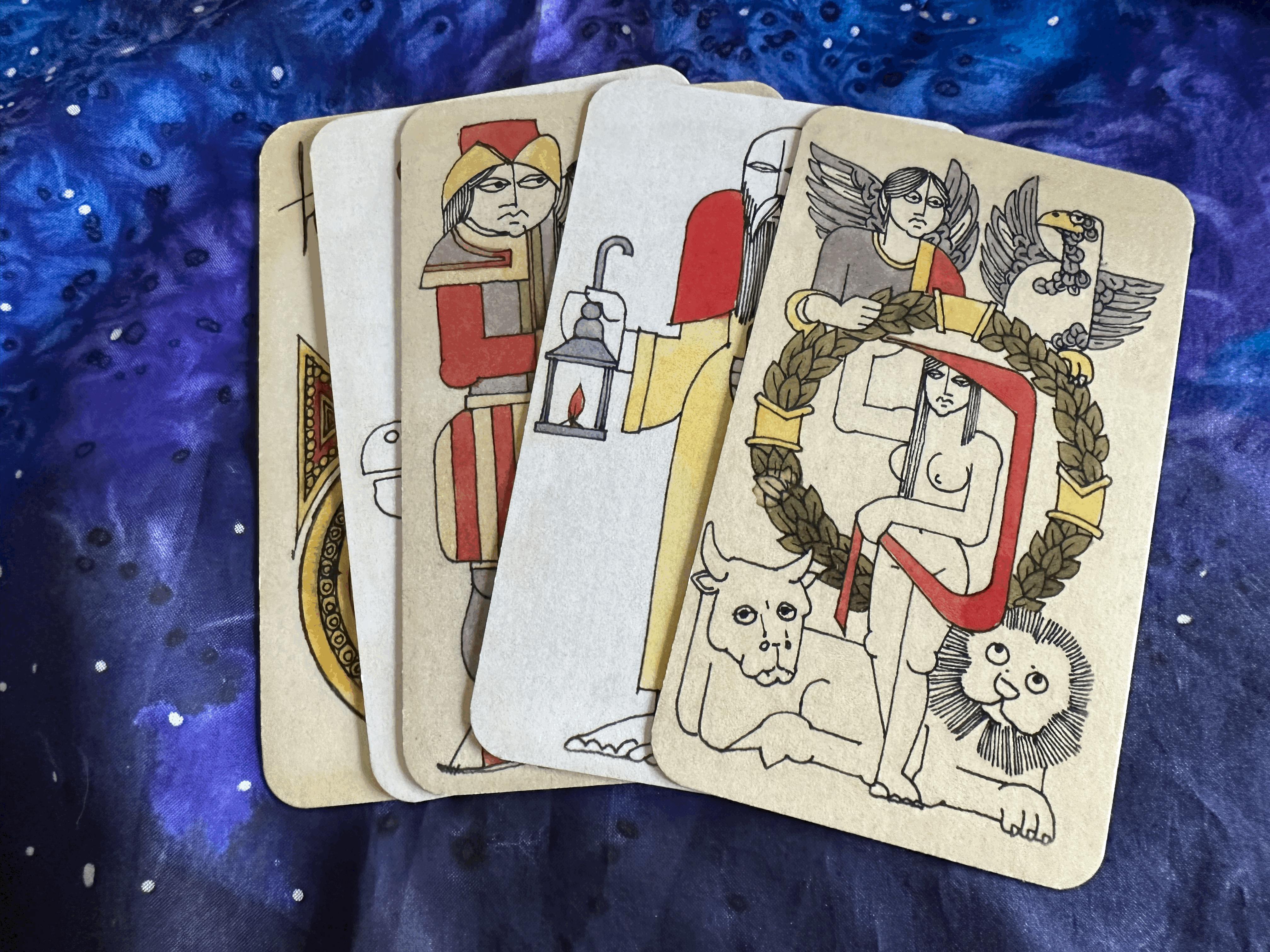
Ferdinando Crippa I Tarocchi
$85.00
Shipping
- Orders Under $20.00 ship for a flat rate of $4.00
- Orders Under $80.00 ship for a flat rate of $6.00
- Orders $80.00 or over ship Free
- All orders ship direct from our warehouse in California. TarotArts will carefully pack and ship orders Monday-Saturday. Orders received by 11:00AM EST will ship the Same Business Day, Mon-Sat. Orders placed after 11:00AM EST will ship the following business day.
- Orders shipping to California will be charged sales tax
- At this Time TarotArts only Ships to destinations in the US
- Please check your address carefully before placing an order. Any package requiring a second shipment because of an address error or marked undeliverable by the carrier will require additional shipping charges.
- TarotArts wants to ensure you're happy with your purchase. Unopened Items in their original condition and packaging can be returned for a refund. Shipping charges are not refundable. If you would like to know more about our Refund policy please review the full Refund Policy